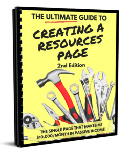
There is a single page on your website that, if used properly, can be amazingly profitable. And the best part is that a little effort goes a long way. That page is your resources page and today I’ll show you how to create a killer one…and the awesome results I’ve had from mine.
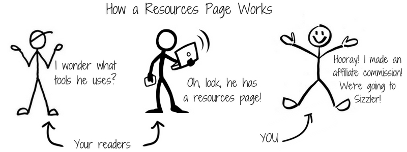
As someone who has spent more than a decade running affiliate programs and promoting affiliate offers, I get asked almost daily about the tools I use.
Prior to one month ago, though, I had no central place to send people. I just kept making one-off recommendations. And the people who follow me (like you) had no place to go to find my favorite tools.
I had no resources page. And that was a HUGE mistake. I’ve come to learn in the past month that a great resources page is not only one of the most oft-visited pages on my site, but it’s also ridiculously profitable.
What is a Resources Page?
A resources page is simply a page on your site on which you list your favorite or recommended tools.
If you are a writer, for example, you might list your favorite writing tools and courses you’ve taken to help hone your craft.
Or, if you are a fitness instructor, you might list various products that serve your audience, such as yoga mats, shoes, and supplements.
Usually, the majority of links on your resources page will be affiliate links, but probably not all of them. On my resources page, for example, about 50% of the links are affiliate links. This makes these pages a great source of passive income.
My Resources Page Results
I launched my resources page exactly one month ago. For most of that time, it’s been split-tested, tweaked, and sometimes totally messed up (like when I had every single link wrong for two days).
Regardless, I’d consider the 12 1/2 hours I spent on it (this includes time spent creating my Recommended Reading and Products pages) a resounding success.
Here are the results from the first month:
Total Product Revenue: $1,198 from 7 different products.
Total Course Revenue: $38.80 (recurring monthly payment)
Total Optins for Products Currently Not Available: 61 (statistically, this should result in another $750-2250 in affiliate commissions)
Total Amazon Commissions: $37.92 (Let’s be real…Amazon doesn’t pay much, but this was the third most I’ve ever made from Amazon in one month)
Total First Month Revenue: $1274.72 plus significant future revenue.
And the best thing is…this is totally repeatable every month. And it scales as my audience grows!
What Makes a Good Resources Page?
After doing research and testing various things on my own resources page, I’ve found five best practices for your resources page.
1. It’s built for your audience, not you.
One of the biggest mistakes I see on resources pages is only listing the tools you personally use. While well-intentioned, this ends up backfiring.
As the experts, you are usually miles ahead of your followers. This is the way things should be. That also means you use different tools that they do.
For example, all of our programs are run on InfusionSoft using a custom plugin we developed. We charge thousands of dollars to use this plugin and that’s on top of the cost of InfusionSoft.
This is out of reach for most people looking at my resources page. So, while I do list both InfusionSoft and our plugin, I also list a more affordable option, iDev Affiliate.
Remember, you’re playing at a different level than most of your audience. Pick your resources with that in mind.
2. It lists products for various topics.
No matter what your platform is about, odds are people come to you for various resources.
Think about the fitness professional again. He might have:
- a nutrition section, a gear section
- a supplements section.
- a section for other instructors
- one for people looking to lose weight
- one for those looking to gain weight.
Oh…and for people training for a specific event…and…well, you get the idea.
To start with, think of the three most common topics people ask for resources. Then create a list for each of those topics.
For me, I went with:
- Tools to Increase Affiliate Commissions. These are tools affiliates can use to make their affiliate marketing efforts easier and more lucrative.
- Tools to Recruit Affiliates. These are the specific tools we use to find affiliates and get them to promote.
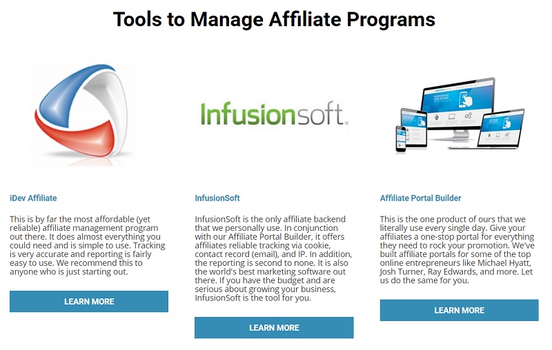
- Tools to Manage Affiliate Programs. These are our recommendations for managing affiliates.
- Tools to Increase Product Sales. These are the non-affiliate related tools we use to promote our own products.
- Tools to Build Your Product. One of the most common questions I get is around how to build a product. But that is not something I plan on being an expert on anytime soon. Perfect for a resources page.
- Tools to Build Your Brand. These are the tools we recommend for things like list building, social media, email marketing, etc.
- Tools for Your Team. I am often asked about how I work with a virtual team, so I listed the three tools we use on our team here.
3. It continually evolves.
Every time someone asks you for a recommended resource, that is probably a good thing to add to your page.
I initially did not have a category for how to increase product sales. It’s not something I talk about that much outside of affiliates, after all.
But shortly after releasing my resources page, I got multiple emails asking specifically about this topic. So I added it to the resources page.
Always be on the lookout for new topics and products to add. If you discover something new, either replace something on your resources page or add it to the page.
4. It lists the best products, regardless of potential affiliate commissions.
Yes, this is a site all about affiliate marketing, but a resources page should list your best recommendations, not just products you get an affiliate commission on.
My resources page, for example, breaks down like this:
Affiliate Links: 16
My Own Products: 3
Non-Affiliate Links: 14
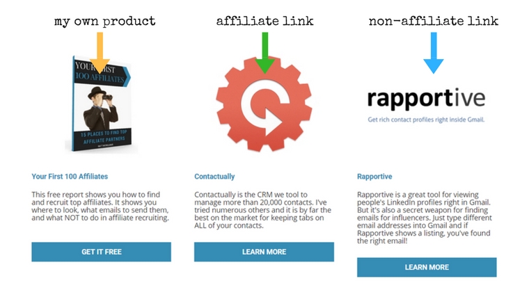
It’s almost evenly split between links that make me money and links that do not.
There is a simple reason for this: My #1 goal is to provide the best recommendations to my audience.
As much as I enjoy making money from this page (and there is absolutely nothing wrong with that), I much prefer hearing from readers who discovered a new tool that helped them.
In the past month, I received three emails from readers:
OMG, Matt. Thank you SO much for recommending Groove. We just started trying it and it’s a gamechanger for my business.
Groove was not an affiliate link, but this person officially loves me for the recommendation.
…just installed Rapportive because of your recommendation. Already, it’s helped a bunch. Thanks again!
Rapportive is not an affiliate link, but the recommendation is helping a reader.
I cannot thank you enough for introducing me to iDev. I’m just getting started, but already we have our first 7 affiliates on board.
iDev is an affiliate link, but this email is worth more than the commissions I make.
Focus on helping your audience and if a product has an affiliate link, that’s a bonus!
Your #1 goal with any recommendation to your audience is to serve them, not make money.
5. It’s more than just a list.
A good resources page isn’t just a list of links. A good resources page will at least have the following:
- Topical headlines to separate content.
- A description of the product.
- A personal recommendation (why you recommend it).
You could additionally use:
- Images (we chose to include the logo).
- A link to a full review (we did this on a few products).
- A quote from an article or other review.
Just make sure that it’s not just a list of links and it’s super easy to navigate.
Examples of Good Resources Pages
Must of what I did with my resources page came from studying others. As I consider the criteria for a good resources page, here are some of my favorites, along with some commentary on each.
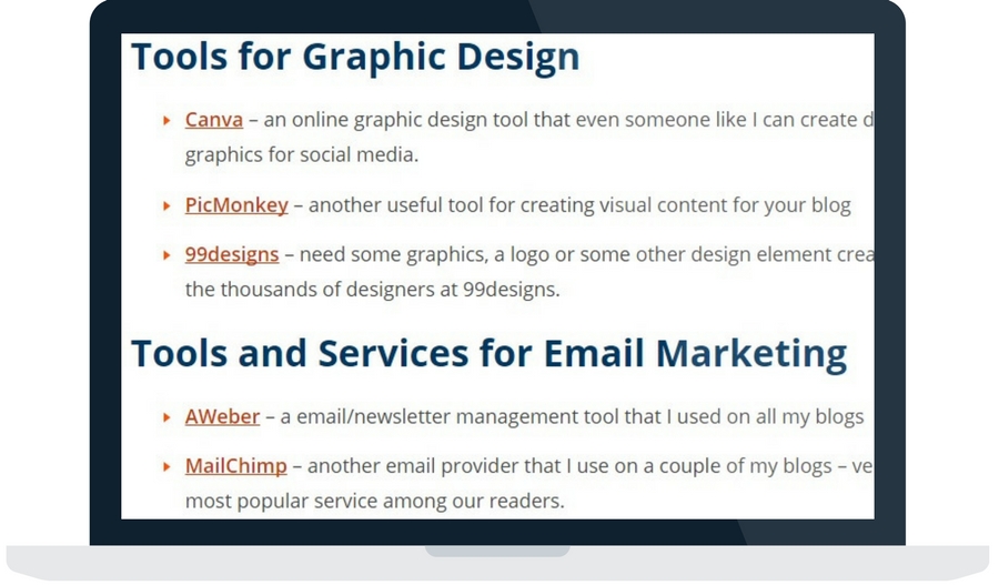
What I Like:
- Categories. Darren does a great job of categorizing the resources. A quick scroll down and it’s easy to find the right tools.
What I’d Change:
- More personal. I’d like to see Darren get more personal with the recommendations. He could share more about why he likes each tool and how it’s helped him.
Pat Flynn’s Smart Passive Income
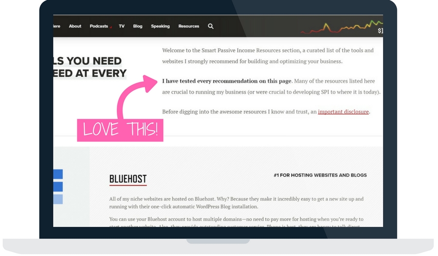
What I Like:
- Beautiful design. Like the rest of his site, Pat’s resources page is absolutely beautiful.
- Personal use. Pat does a great job of pointing out that he personally does or has used all of the products on the page. He really uses this to his advantage.
What I’d Change:
- Nothing. Seriously, anything I might suggest is minor and not worth mentioning. Go check out his resources page and clone it if you can.
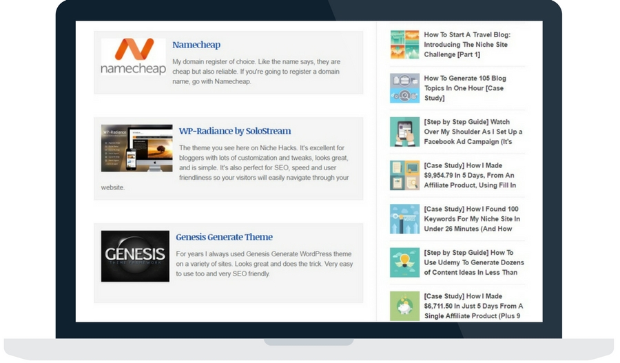
What I Like:
- Use of images. Really declutters the page by breaking up the text. Makes each listing stand out rather just a sea of links and text.
- Plenty of spacing. Another way to effectively declutter a page.
- Use of special offers. Stuart does a great job of getting companies to offer his readers special offers and uses them on his resources page.
What I’d Change:
- More descriptive listings. Some of the listings are pretty thin. I’d like to see more “why I recommend this” text.
There you have it. Just above everything you could ever want to know about creating and monetizing a resources page.
How I Built Mine (Plus a Challenge)
In case you are wondering how I created my resources page, I did it using a very modified version of the “Book Sales Page” template on LeadPages.
So…regardless of how you create your resources page, what are you waiting for?
My challenge to you is to create your own resources page in the next two weeks. Mine took hours to complete, but it’s continued to evolve. It doesn’t have to be perfect, just published.
Questions?
Text me anytime at (260) 217-4619.
Or…check out some of my free reports to help you get on the right track:
 |
 |
 |
 |
 |
 |
 |
 |
 |
