Two months ago, I had my best month ever in passive income. I finally broke through the $10,000 mark. All from a single page on my site and all 100% passive.
All of this $10,000+ came from my resources page.
This single page hasn’t been touched in more than six months (which is actually a bad thing…I should be updating it more often). All $10,000, therefore, was completely passive income.
Below, I’ll share how I did it and what’s working on my resources page. I’ll also challenge you to add your own resources page (or improve it) and enter to win a really cool contest.
I’ve written before about how to put together a killer affiliate resources page, so check that out if you want a step-by-step guide on resources pages.
CONTEST: Enter My Resource Page Contest for a Chance to Win Prizes Valued at $1,311.32 – When you enter you also get exclusive resources to help you create YOUR killer resource page — including a video critiquing 5 resource pages, 12 sample resources pages to review, and other great exclusive content to help you make a killer (and profitable) resource page. Enter to win here.
Income Breakdown
Below I break down the income from my resources page in the $10,000 month. As you’ll see, it’s a highly diversified mix (just like you want it!).
iDev Affiliate: $560
LeadPages: $719
Ramit Sethi: $4,073
ConvertKit: $610
Blog Mastermind: $1714
Pretty Link: $58
Advanced Ads: $381
LinkTrackr: $312
Raven Tools: $42
Danny Iny: $1908
Books (Amazon): $188
Total Revenue: $10,565
NOTE: This does not include $1,297 from my own products we sold from the resources page. This is just affiliate commissions.
What Makes a Great Resources Page
I’ve written previously about how to create a killer resources page that is CRAZY profitable. In that post, I share 5 things that make a good resources page.
I’m not going to address those 5 in length here, so be sure to go check out that post.
But in short, the five were:
1. It’s built for your audience, not you
As the expert, you are usually miles ahead of your followers. This is the way things should be. That also means you use different tools that they do.
2. It lists products for various topics
To start with, think of the three most common topics people ask for resources. Then create a list for each of those topics.
3. It continually evolves
Every time someone asks you for a recommended resource, that is probably a good thing to add to your page.
4. It lists the best products, regardless of potential affiliate commissions
Mine is equally split between links that make me money and links that do not. As I say in the post, there is a simple reason for this:
My #1 goal is to provide the best recommendations to my audience, regardless of potential commissions.
5. It’s more than just a list
Your audience trusts you and your recommendation, make sure to give them more than just a link. I share what each product recommendation should include in the post, so go check it out.
Here are two more “musts” for a great resources page:
6. You link to it often
One reason I did so well that month was that I did a lot of podcast and summit interviews and was constantly referring people back to my resources page.
You can hear me say over and over again on podcast and summit interviews,
“You know actually, I’ve got a link for that on my resources page at mattmcwilliams.com/toolbox…”
You want to link to it as frequently as possible (as I am doing in this post). Mention it as much as it makes sense.
If people ask you about your resources in a podcast interview, be sure to mention your resources page.
In short, mention it as much as is practical, without be annoying or coming across like a salesman.
Remember point #4 above, your first goal should always be to help your audience. If you can do that by sharing your resource page, do it.
7. Don’t forget the analytics
One of the mistakes I made when I first put up my resources page is that I put up no analytics.
So I had no idea…
- How much traffic was going to the page
- How they were getting to the page
- Which links people were clicking on
This means that it was very hard to improve my resources page. I simply didn’t know enough about the page. I literally had no idea how people were interacting with the page.
That is a HUGE NO-NO!
Make sure you install Google Analytics or another analytics service on your resources page.
Then pay attention to how people are getting to your page.
What pages, posts or sites are they coming from?
What podcast or summit interviews are they coming from?
Are you getting search traffic or social media love?
Next pay attention to what links they are clicking on and really analyze that information.
Examples of Great Resources Pages (from Our Students)
We recently did a contest with our No Product No Problem students where we challenged them to create their own resources page in just 7 days.
We are doing another contest for all of my readers and I’ll share more details about that below, but I wanted to share with you the top three resource pages that our students put together.
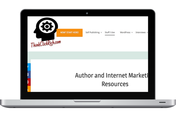
#3 – Chris Naish’s ThinkClickRich.com
Chris works with authors, aspiring authors and online marketers who are trying to get their message in front of more people.
What I like:
- Categories. Chris’ page is easy to navigate. If you are looking for site design resources, list building or image or graphic resources you can find them. Fast.
What I’d Change:
- Images. Like they say, pictures say a thousand words. They also break up the text. A few more pictures on Chris’ page would make it easier to read and easier to consume the information.
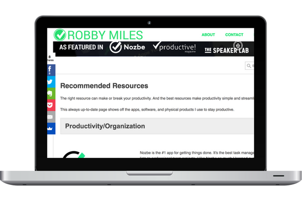
#2 – Robby Miles’ Streamline Productivity
Robby blogs about how to reach maximum productivity at work and at home and the guy practices what he preaches!
What I like:
- Design. This is just a very clean, easy to read page. He makes great use of graphics and descriptions of each product and it’s easy to navigate.
What I’d Change:
- Above the fold. I would specify exactly what or who the resources are for, such as: “Recommended Resources for Productivity Ninjas”. I would also add the FTC Disclaimer to the top of the page.
#1 – Chantel Arnett’s Blogging With a Smile
Chantel brings a cheering approach to how to blog as a business. Monetization, strategy, technology and more.
What I like:
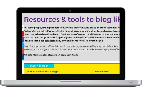
- Linking to relevant content. Chantel gave ME an idea for my resources page as I looked at hers. She links to her guide on “Affiliate Marketing for Bloggers” right at the top of the page. Talk about putting your audience first! She got extra points for that…and I’m going to copy her very soon 🙂
What I’d Change:
- Images. I really like Chantel’s page…but again, images. Having images completely change the way a page looks and feels. It feels more inviting (and less like studying for my college chemistry test…I hated that class!).
In addition to these pages, we had several more great resource pages submitted, and each student who accepted the challenge is on their way to creating passive affiliate income for themselves!
Now It’s YOUR Turn to Win
As I mentioned above, we are currently running a contest to see who can create the best resource page.
When you enter the contest you will be given access to exclusive resources to help you create a killer resource page, including:
- Video critique of the Top 5 resource page entries from our No Product No Problem contest
- In depth overview of MY resource page
- Sample resource pages
- Other tips and resources for creating YOUR resource page
The winner will win my 5 favorite marketing books of all time PLUS a 30-min one-on-one coaching session with me.
That’s a $1,311.32 value!
Plus when you’re finished, whether we choose your page or not, you will still have a functional resource page that can begin earning YOU passive affiliate income!
The contest is open until midnight Pacific on July 28th.
One of our NPNP students, Jim Folsom actually thanked us for creating the deadline because it caused him to get moving and create his page.
Will this deadline do the same for you?
